ShopDreamUp AI ArtDreamUp
Deviation Actions


Suggested Deviants


Suggested Collections


You Might Like…


Featured in Groups

Description
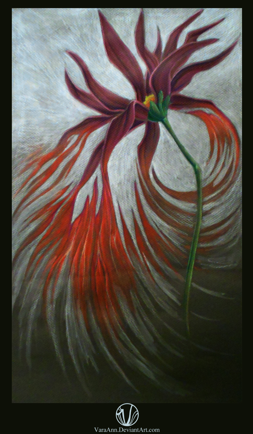
Done for the Series Drawing class I'm taking this semester. For the assignment, I had to create a non-narrative series, and I continued with my theme that I will continue for the rest of the year. My theme: to cross certain plants and certain elements of human anatomy together, making them combine yet separate. Its not my intention for this theme to be gross, its more for the idea, to get it out and have it seen. This drawing is intended to help me come up with more ideas for my BFA show this fall. I will most likely paint an oil painting exactly or similar to this drawing. What can I do to improve this drawing?
For this drawing, I came up with the daisy on my own, no refs. And then, I added the muscle (thin cut steak) and made it look like it was tearing away from some of the petals, then going back up to the petals on the right side of the flowers.
For the title, I can't think of anything better at the moment :/ I like the idea of calling my series, "Organic Incapability," or "Organic Juxtaposition." idk, still thinking about it
Drawn on a half sheet of Canson dark grey Mi-Teintes paper, with Prismacolor color pencils
Flower/Muscle Combination 1 © =VaraAnn/Kara Vines
Image size
877x1500px 976.74 KB
Make
NIKON
Model
COOLPIX S3100
Shutter Speed
10/60 second
Aperture
F/4.2
Focal Length
8 mm
ISO Speed
800
Date Taken
Feb 21, 2013, 7:07:27 PM
© 2013 - 2024 VaraAnn
Comments4
Join the community to add your comment. Already a deviant? Log In
I'm taking a very similar class right now. I can definitely see your series taking you in a lot of interesting directions. This piece is fabulous. There's a lot of tension around the focal point that makes me happy, especially with how it looks like the muscles are pulling the flower down. The color scheme makes me a little uncomfortable, but in a good way!
I also like that you didn't use a reference for the flower. I feel like that gives you a lot more control over your composition, which is something you'll need in a series like this. I assume that you intend to work mostly in abstract, like this one?
My main suggestion for the painting of this drawing is for you to tinker with the negative space. I love love love how the pencil marks radiate from the focal point. Definitely keep that. What I don't like so much is the far top and bottom. The empty space seems arbitrary. The piece is a little too bottom-heavy for my liking. If you could extend the gray parts further down and adjust the position of the flower a little bit, I think you'll be golden.
Also, did you intend for the bottom gray ray-things to feather out or be more like stripes? It's kinda between those two.
Anyway, I'm totally going to watch you now. I want to see how your series goes!!